Thursday, 17 November 2011
Saturday, 12 November 2011
Tuesday, 8 November 2011
Monday, 31 October 2011
Wednesday, 26 October 2011
Thursday, 20 October 2011
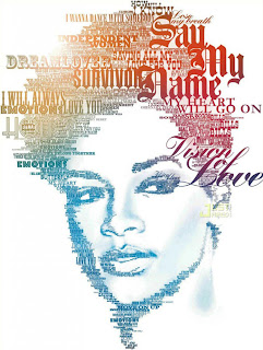
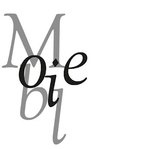
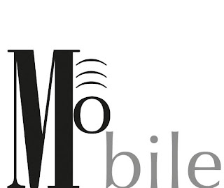
heteronyms brief so far....
if you feel like you want a help out... then i'll ask the question!
HOW CAN I MAKE IT BETTER? colours? fonts?
hope you like it.
Wednesday, 19 October 2011
Tuesday, 18 October 2011
Designer.. (typo)
Giambattista bodoni
born 16. 2. 1740 in Saluzzo, Piedmont, Italy
as far back as 1758, in the printing house of Propaganda Fide a Roma, in 1768 he was asked to run the printing house Regia of Parma where we began to print valuable editions, using inks mixed by himself. In 1771, he established his own typography where he cast characters of a rare perfection and printed editions which became immediately famous for their fine engravings, the beauty of their coat of arms, the elegance of the front pages, the quality of the paper and the nature of the inks.
The rules of his art were written by Bodoni himself and are demonstrated in the "Manuale tipografico", pubblished after his death by his widow Margherita Dall'Aglio in 1818.
Bodoni was the most successful early proponent of what is referred to as the “modern” typeface, distinguished by a strong contrast between the thin and thick strokes, and vertical, rather than oblique, shading. His books were produced for the wealthy and the aristocracy, and were more advanced in elegance and refinement than anything else being printed in Europe. Intended more to be admired than used.
Subscribe to:
Comments (Atom)


